Counter-Points
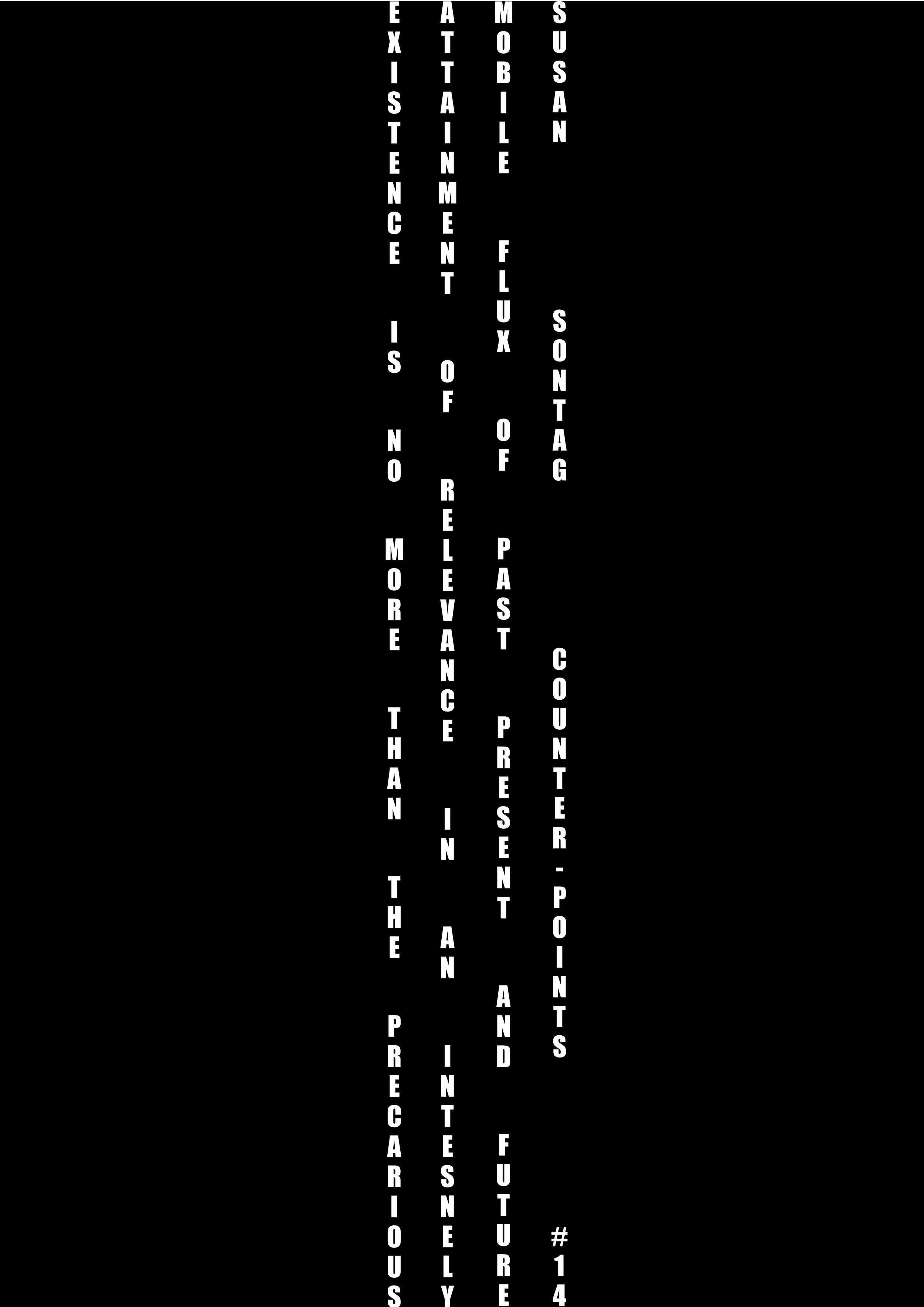
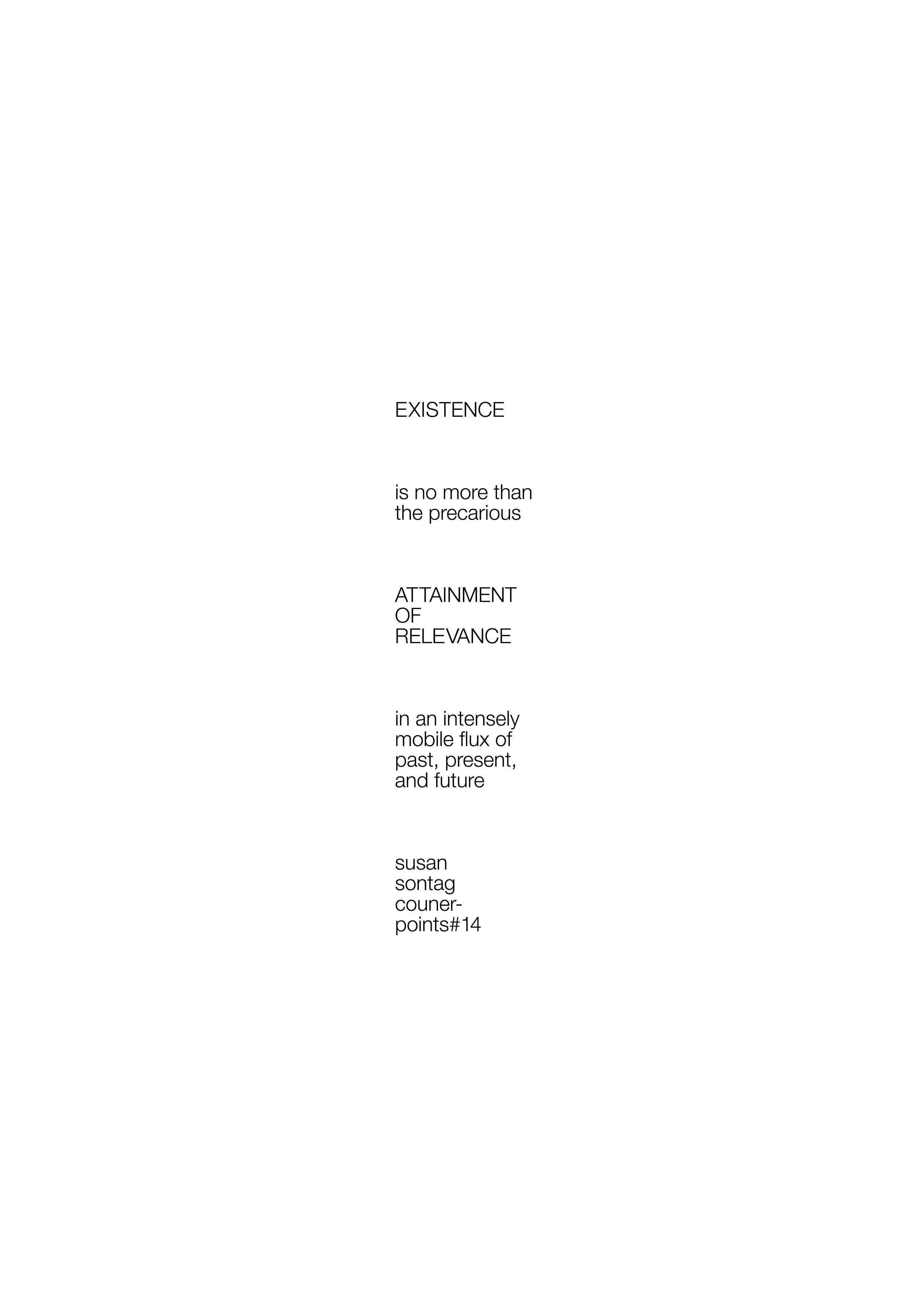
Counter-Points explores the role of the poster as a communication tool, examining how typography shapes readability, hierarchy, and meaning. The project is divided into two contrasting outcomes: the "Bad Poster," which prioritizes conceptual expression over legibility, and the "Good Poster," which emphasizes clarity, accessibility, and effective information delivery. Together, the two posters investigate the balance between visual experimentation and functional communication.